In a web mapping application we use the possibilities and tools of the client side map libraries for the sake of goals to achieve. These goals are related to the maps GIS nature: we want to analyze, or want to find connections on the base of geographical information.
Maps can handle multiple types, or multiple source of information, and they can put them on each other. We can switch between these layers to display only one at once, but multiple layers can be visible simultaneously, setting the opacity of each layer.
With these options we can bring in the temporal aspects of a research, comparing before and after images, processes, and with a little client side programming, we can make time-lapsed maps.
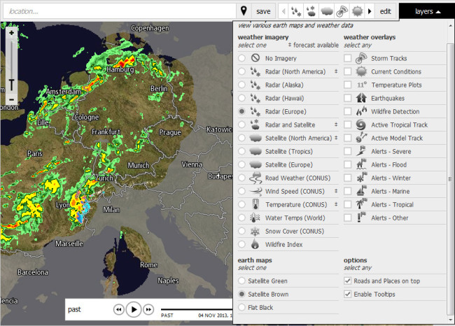 Usage example of different layers on online maps (http://www.intellicast.com)
The other very useful tools of the map libraries are markers. With these we can mark a point of interest on the map assigning further information to that point. For example, we can mark specific incidents, attacks, events on a map, and together they can visualize the geographical distributions of these events. We can assign further information for these markers, the types of events, the date of events, people related to the event, and so on, and we can write applications which show different images according to type, or filter these markers according to their features. Placing them on a map visualize the geographical aspects of these events property by property.
There are programmatic features which allow rallying several markers into one if they are very close to each other. With this the map will not be overcrowded. Markers may have different sizes according to the number of points they represent, or other features.
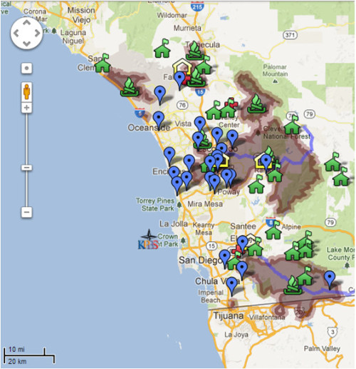 Usage example of markers during the fire of San Diego in 2007
Vector shapes are the next type of tools which can be used to visualize data. With them lines, circles, polygons can be put onto a map. They can represent routes, boundaries, countries, continents. They have several features which can be manipulated according to the data they represent: the color of the shape, the color of the contour, the width and style of the contour, the opacity of the shape, etc.
With the help of vector shapes we can draw routes between markers, we can draw geographical tendencies, analyze data and draw the boundary of events.
Vector shapes can be used to put different diagram and charts on the map. For example a pie chart can be placed above the bigger cities, showing the social distribution of the city. The size of such vector shapes can be used to emphasize the differences in data.
Vector shapes can highlight the different spatial objects: countries, counties, city boundaries, districts, and so on, and with their color appearance or attached number they can visualize data.
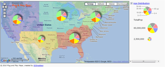 Polygons and pie charts on maps
Images and other HTML objects can be attached to geographical points: links, documents, photos, and so on.
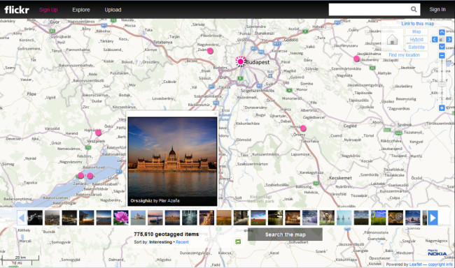 Images on map
We can use our own image layer positioning it over the real image data. This can be used for example in historical researches. We can overlay the whole map or only the part of the world. There are great examples in Rumsey’s Geogarage.
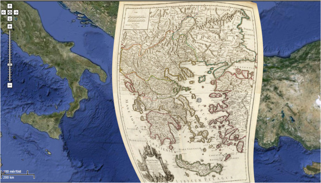 Using special image layer showing the ancient Greece in Rumsey's Geogarage.
On a dense map we can visualize the frequency of some kind of points assigning different colors to the number of points in an area. This is called heat map. In the following example on the first layer the locations of earthquakes are displayed as a heat map. On the second layer the known place of nuclear reactor are shown. The two layers altogether can highlight which reactors are exposed to earthquakes, and which part of the world is where nuclear reactors can be safely established.
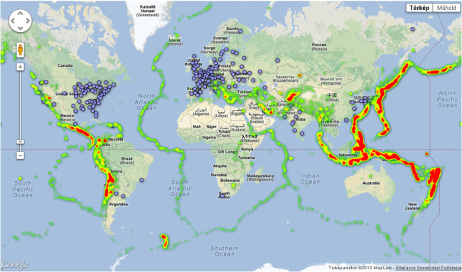 The locations of earth quakes displayed as a heat map, overlapping the locations of nuclear reactors.
Finally the displayed map data can also be replaced. It is useful if we want to show a map from an earlier date, for example the boundaries in the beginning of the 20th century, or ancient or medieval Europe. To this we need the appropriate map data, and we need a map server which fulfill our requests.
  |
 |
 |
Generated with ELTESCORM framework