In this chapter our goal is to introduce tools whit which creating online maps is very easy, and can be achieved by everyday users. First we present Google Fusion Tables in which no programming is needed to create online maps using our own data. Second, the Google Chart Tools will be shown, where minimal programming is needed to create online maps.
Google Fusion Tables is a high level tool to easily visualize geographical data on online maps using the Google architecture like spreadsheet like data table from Google Docs and maps from Google Maps. Google Fusion Tables is just one kind of type of documents in Google Docs (or in Google Drive), and can be reached in the Create menu on the main screen.
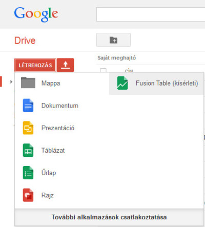 Creating a new Fusion Table document in Google Drive
During the creation of a new fusion table, we can determine the source of the data. We have two main choices:
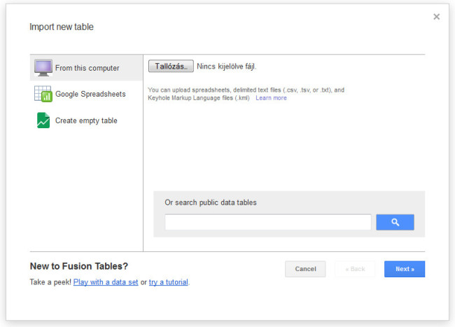 New Fusion Table options
Our data can be in different formats:
Let us say, we have the following data in an Excel spreadsheet:
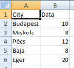 Data in an Excel spreadsheet
Choosing the file, we can upload it, and go through the simple import process.
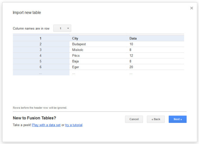 Intermediate step during the import process of the uploaded spreadsheet
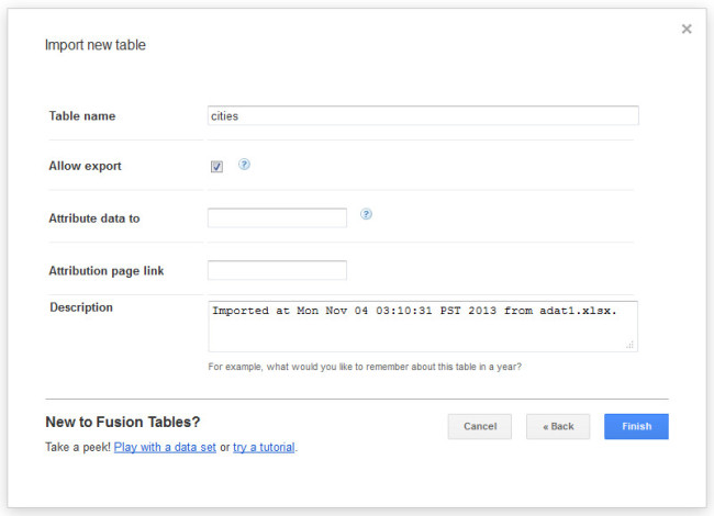 Intermediate step during the import process of the uploaded spreadsheet
After importing the spreadsheet, the data is shown up in a spreadsheet-like data table. This is very similar in functionality to Google’s spreadsheet application.
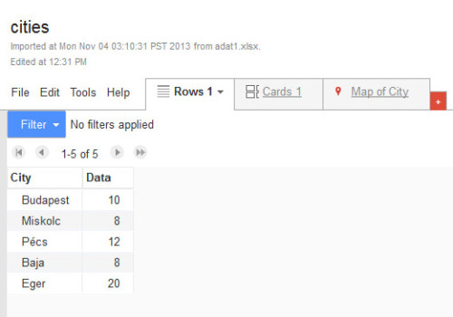 The data table in Fusion Tables application
To display data on the map, we have to select the column which contains the geographical information. This can be achieved in several ways:
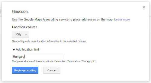 Geocoding in Fusion Tables
On the map, we can change the map styles, aka how the markers and map objects in general are displayed.
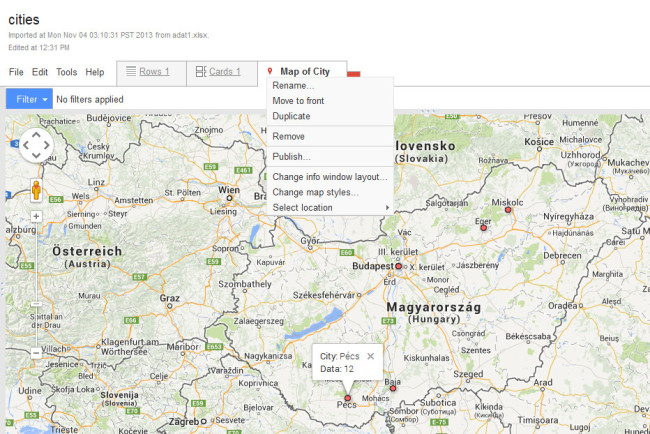 Map showing the imported data
We can search the web for the desired data. Among the search result there are web tables and fusion tables. We can use other fusion tables, make our own copy of it, and modify it in the way we need it. The next figure gives an example of using another fusion table containing KML information. This column forms the basis of the geographical information, and the style of these KML polygons, such as fill color, border color, border width, etc, are bound to data of other columns.
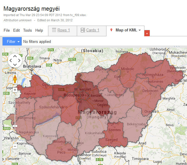 Map of the density of population in different counties og Hungary
The other examples will be a heatmap of geo-tagged Wikipedia articles. After selecting new Fusion Table in Google Drive, we can search for geo tagged wiki terms. On the search result page the Fusion Tables category must be selected.
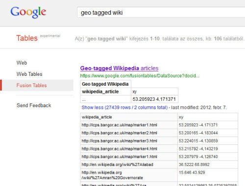 Searching for geo-tagged Wikipedia articles among fusion tables.
Selecting the appropriate data source, the data table is shown up with an xy column containing the geographical information.
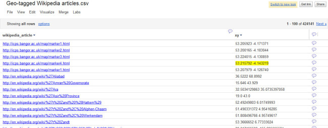 The data table of geo-tagged Wikipedia articles
Selecting the Map menu in the Visualize menu, the data is displayed on the world map. Checking the Display as a heat map option, the frequency of points is represented as different colors from green to red. (At the time of writing heat maps can be selected only in the old look of Fusion Tables, so we have to change for the old look before starting to visualize data.)
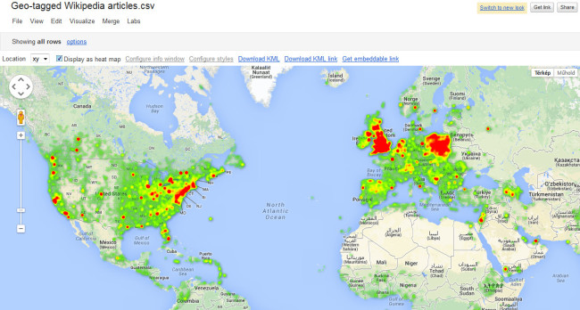 Heat map in Fusion Tables.
These maps can be shared with anyone, or can be exported in an HTML file for embedding in a web page.
These are map based chart tools, which need a minimal programming knowledge, but mainly these tools simplify programming as a parameterization problem, where the necessary data need to be changed in a program template. One of the simplest solution among many others is the GeoChart tool of Google Chart Tools. GeoChart is a simple tool for displaying data on online maps. It has two different modes:
In region mode different regions of the world, or continent, or country can be colored according to the underlying data. The following example shows a template of GeoChart in region mode:
<!DOCTYPE html PUBLIC "-//W3C//DTD XHTML 1.0 Strict//EN" "http://www.w3.org/TR/xhtml1/DTD/xhtml1-strict.dtd">
<html xmlns="http://www.w3.org/1999/xhtml">
<head>
  <meta http-equiv="content-type" content="text/html; charset=utf-8" />
  <title>Google Visualization API Sample</title>
  <script type="text/javascript" src="http://www.google.com/jsapi"></script>
  <script type="text/javascript">
    google.load('visualization', '1', {packages: ['geochart']});
    function drawVisualization() {
      var data = google.visualization.arrayToDataTable([
        ['Country', 'Popularity'],
        ['Germany', 200],
        ['United States', 300],
        ['Brazil', 400],
        ['Canada', 500],
        ['France', 600],
        ['RU', 700],
        ['Hungary', 9]
      ]);

      var options = {
        width: 556,
        height: 347,
        region: 150
      };
      var geochart = new google.visualization.GeoChart(
      document.getElementById('visualization'));
      geochart.draw(data, options);
    }
    google.setOnLoadCallback(drawVisualization);
  </script>
</head>
<body style="font-family: Arial;border: 0 none;">
<div id="visualization"></div>
</body>
</html>
Without really know the JavaScript code, one can identify the displayed data block. In the beginning only this is needed to be modified. The options block determines the width and height of the chart, and selects the region to be displayed. For example 150 means Europe. Google Chart Tools have a very detailed documentation where every aspects of these tools are described.
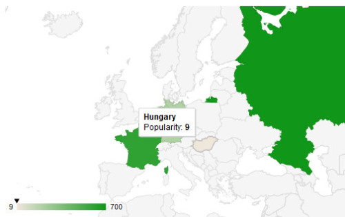 Region mode in the GeoChart tool
In marker mode the data is displayed as markers, specifically spheres, where the style of these spheres can be bound to the data. The template for this mode is shown below:
<html>
  <head>
    <meta charset="utf-8">
    <script type='text/javascript' src='https://www.google.com/jsapi'></script>
    <script type='text/javascript'>
     google.load('visualization', '1', {'packages': ['geochart']});
     google.setOnLoadCallback(drawMarkersMap);
      function drawMarkersMap() {
        var data = google.visualization.arrayToDataTable([
            ['City', 'Population', 'Area'],
            ['Budapest', 200, 230],
            ['Eger', 300, 53],
            ['Miskolc', 400, 34],
            ['Pécs', 500, 43],
            ['Siófok', 600, 22],
            ['Kőszeg', 700, 10]
        ]);
      var options = {
        region: 'HU',
        displayMode: 'markers',
        colorAxis: {colors: ['green', 'blue']}
      };
      var chart = new google.visualization.GeoChart(document.getElementById('chart_div'));
      chart.draw(data, options);
    };
    </script>
  </head>
  <body>
    <div id="chart_div" style="width: 900px; height: 500px;"></div>
  </body>
</html>
We have to specify displayMode as markers among the options, and we can bind color values for the data in the colorAxis option.
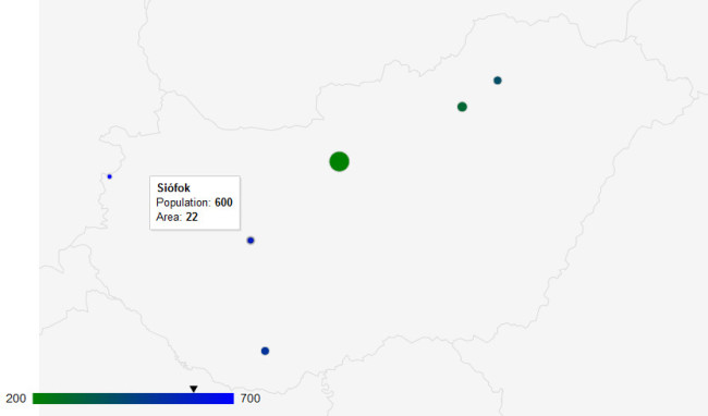 Marker mode in the GeoChart tool
  |
 |
 |
Generated with ELTESCORM framework